Showing posts with label Extras. Show all posts

Friday, September 24, 2010

15 Things Every PC User Should Know

Whether you’re a grizzled tech veteran or an uninitiated newbie, here are 15 essential facts and tricks that you ought to know.

Think you know tech? If you don’t have a handle on every single one of these 15 tech facts, habits, and efficiency tricks, you’re not living up to your potential.
1. Don’t double-click everything: Windows 101: Double-clicking is how you open items in Windows. It’s not how you open links in your Web browser, click buttons in dialog boxes, or do pretty much anything else–and if you reflexively double-click, you might accidentally zip right past something important or submit a form twice. If you don’t need this reminder yourself, chances are you know someone who does.
2. Use slashes and backslashes in the appropriate situations: Let’s get it straight: / is a slash (or forward slash, if you must), and \ is a backslash. Backslashes are conventionally used for Windows file paths (C:\Program Files\Whatever), while slashes are used for Internet addresses (http://techknometer.wordpress.com/).
3. Record the exact error message: When your PC crashes, it’ll usually try to tell you why it is doing so–albeit with a string of numbers and letters that you won’t understand. Write the message down in its entirety (or take a screenshot, if possible) so you can later plug it into Google or give it to your tech support agent. If your PC didn’t provide an error message, go to Action Center (in the Control Panel) and see if it shows up under ‘View archived messages’ or ‘View problems to report’.
4. Bring deleted files back from the dead: When you delete a file from your PC or memory card, you’re not wiping it off the actual hard drive. Instead, you’re simply removing the index information that tells your PC where the file is, at which point the PC is free to treat the part of your disk that contain that file as empty space that it can write something else to. If you’ve accidentally deleted something, undelete utilities such as Recuva can help you find those files again as long as you haven’t already written over that file with something new.
5. Wipe your hard drive before getting rid of it: Because your PC doesn’t immediately get rid of the files you delete, you can’t just reformat your hard drive before recycling or selling your old computer–because someone might be able to use an undelete app to recover your sensitive data. We have all kinds of tips for completely erasing an old drive, but the short version is: grab Darik’s Boot and Nuke.

6. Uncheck the boxes before you install: Lots of helpful apps out there give you the option of installing search toolbars and other add-ons–and some of them are so pushy about being helpful that their installers are configured to install the uninvited extras unless you check a box saying you don’t want them. Not only is each add-on another thing that your PC needs to load, but you have no idea what kind of data it could be sending out. They come bundled with the app because they make money for the app developer, not because they’re particularly useful. So take a close look at what you’re installing before you click Install–and in return, the installer won’t change your search engine or install apps you don’t need.


7. Beware of viruses living in Office docs: Experienced Microsoft Office users can take advantage of its built-in Visual Basic for Applications support to automate complex tasks with macros. However, malicious coders can use those same tools to design viruses that may interfere with your work and that of your colleagues. By default, Office is set to disable all macros and notify you when a doc you’re reading contains them (to toggle this setting, in Word, select Word Options, Trust Center, Trust Center Settings, Macro Settings), so you should already be safe on this score.
8. Be skeptical of cleaning” apps: Apps that make vague claims about improving your PC’s performance and clearing out its clutter (Registry cleaners, I’m looking at you) will generally do more harm than good (if they do anything at all). To clean up your system, simply run Disk Cleanup (to reach it, select Start Menu, All programs, Accessories, System Tools); it comes with every Windows installation and it won’t mess up your PC.


9. Uninstall your old apps: If you regularly download and install new apps from the Internet, you should get in the habit of pruning your collection every now and then. To do so, open the Programs and FeaturesUninstall to ditch items you no longer want. You may need to take a trip into your C:/Program Files/ folder to hunt down a few additional unused apps. The less stuff you have on your PC, the less things are to go wrong. control panel, scroll through the list, and click
10. Don’t let a spilled drink ruin your laptop: If you keep your cool when a spill occurs, you may be able to prevent your data from disappearing and your motherboard from frying. Instead of panicking, quickly but methodically unplug the power cord and yank out the battery–don’t wait for Windows to power off. Next, detach anything connected to the PC (network cables, USB devices) and pull out any readily removable components such as an optical drive. Tilt the laptop to try to drain the liquid in the direction that it spilled onto your PC, but be careful–you don’t want to tilt the laptop in a direction that would allow the liquid to seep even deeper in. If you see liquid on the surface of the laptop, dab it off with a towel. At this point, unless you’re comfortable disassembling your PC and cleaning it with electronics cleaner, you’ll probably want to take it to a tech.
11. Turn down UAC: Both Windows 7 and Windows Vista include a security function called User Account Control, which dims the screen and flashes a dialog box whenever you install an app or change your system settings. Though this arrangement can be useful for catching sneaky apps that are trying to install or change things without your knowledge, it can also be annoying. If you use Vista, grab TweakUAC to make it less annoying without turning it off. If you use Windows 7, the default settings aren’t too bad, but I recommend that you go into the User Accounts control panel, click User Account Control settings, and change the setting to the third notch down, so UAC will still warn you but it won’t dim the screen.
12. Don’t work in your admin account: Many PC users are accustomed to doing their everyday work while logged in to their PC’s administrator account–especially in Windows XP. Doing so can save you the hassle of having to log in and out when you want to install apps or make changes, but it also leaves you much more vulnerable to viruses and malware–so don’t do it.
13. Keep your Control Panel in Icon View: The Control Panel’s Categories view can be useful if you’re intimidated by the many different options available, but it can also make finding what you’re looking for more difficult (especially if you’re following detailed instructions that refer to the control panels by name). Click Classic view on the left (in Vista) or choose Large Icons from the View by dropdown menu in the upper right (in Windows 7), and you’ll have ready access to all of the control panels.


14. Clear your system tray: Apps often park themselves in the system tray (the row of icons on the right side of your taskbar) and stay open without your realizing it. Take the time to clear it out occasionally. Open the Notification Area Icons control panel, and check the box on the bottom that says Always show all icons and notifications on the taskbar to get a sense of how cluttered your system tray is; then right-click each one you don’t need and choose Close. Your RAM will thank you.


15. Manage your power settings: If you’re using a laptop, you’ll want to know how to change your power settings so your PC doesn’t waste battery when you need to conserve it, doesn’t slow down when you need to go fast, and doesn’t go to sleep at an inopportune moment. Open the Power OptionsChange plan settings, Change advanced settings; there you’ll find detailed options related to your battery, Wi-Fi radio, graphics card, and more. control panel, and choose from among several presets containing different configurations for when you’re plugged in and when you’re mobile–or feel free to create your own. To access the advanced settings, click

CloudMagic Speeds Up Gmail and Google Apps Searches

used to think that Gmail’s built-in search feature was fast, but that was before I tried out CloudMagic (free). This browser extension (available for Google Chrome and Mozilla Firefox) can search your Gmail so quickly that you’ll never be able to look at Gmail’s own search tool the same way again.
CloudMagic screenshot
CloudMagic’s search results display in an unobtrusive panel that appears on the right side of your Gmail screen.
CloudMagic installs within seconds, and once it’s up and running, it appears as a small search bar on the upper right hand side of your Gmail window. Right now, CloudMagic, which is still in beta, works only with Gmail and Google Apps e-mail, but the maker says support for Google Docs e-mail is coming soon, as is support for Hotmail, Yahoo Mail, and others.
The CloudMagic search bar appears automatically in your Gmail window, but you still need to manually add your Gmail account (or accounts–CloudMagic allows you to add as many e-mail accounts as you’d like, and you can search the contents of one account from within another) by offering up your user name and password. CloudMagic says your password is stored locally on your own PC, similar to the way an e-mail client such as Thunderbird would store it, so you don’t have to worry about its security.
Once you’ve added your accounts to CloudMagic, it begins indexing all of your messages. The initial indexing process takes some time (more than an hour on my Gmail account, which currently holds more than 5,000 messages), but you can begin using CloudMagic before the indexing process is complete. I was surprised at CloudMagic’s retrieval speed even during ongoing indexing.
CloudMagic displays search results as you type, and the results appear in lightning speed. The list of results includes contacts and messages, and appears in a panel that drops down from beneath the CloudMagic bar. You can see the sender, subject line, and a brief preview of an e-mail message; clicking the message brings up another panel with its full contents, which appears to the left of the CloudMagic results list. Rather than crowding your screen, CloudMagic’s layout actually makes it easy to preview a message that you’re searching for, while still allowing you to view your Gmail unobstructed. This means you can search for one message while composing another, and can copy and paste info from one to the other.
My only complaint about CloudMagic is that each installation works on only one computer; despite the name, your index of messages is not saved to a cloud, where it would allow you to access it whenever you access your Gmail. If you want to use CloudMagic on another computer, you’ll have to install it there, too; while the installation and initial index is easy enough to set up, I just wish you didn’t have to go through it twice. I typically access my Gmail account on a variety of desktop and laptop computers, and I’ve gotten so used to CloudMagic’s speedy search that I’d like it to be more readily available wherever I go.
 

Thursday, September 16, 2010

Microsoft’s IE9 Beta Released!!!

Microsoft’s IE9 Beta Released!
Microsoft have released the first public beta of Internet Explorer 9.0 on September 15, 2010. As announced before that it will be a fully-operational browser without the limitations imposed by the developer preview edition (it will have address bar, navigation, and no restricted functionality).
IE9 is Microsoft’s attempt to catch up and potentially overtake the competition. The browser will feature hardware-accelerated HTML5, CSS3, SVG, canvas, a new JavaScript engine and vastly improved standards support.
Unfortunately, the IE9 beta will only run on Windows Vista or 7 and will overwrite your current version of Internet Explorer. Be wary if you only have one Windows PC used for IE8 testing purposes. You have one month to consider the options:
  1. Buy another PC for IE9 testing. That’s certainly an option for larger corporations.
  2. XP users who don’t want to upgrade will need to install Windows Vista or 7 in a virtual machine to test IE9.
  3. Windows Vista or 7 users could install IE9 beta and run IE8 in a virtual machine. Windows 7 Professional and above includes XP mode so there’s no need to purchase further Windows licenses.
  4. Alternatively, Microsoft will provide another edition of the Platform Preview if you don’t want to affect the software and settings on your PC prior to the final release. Again, this will only install on Windows 7 or Vista SP2.
Of course, Microsoft could make this so much easier if multiple versions of Internet Explorer could be installed on the same PC at the same time. Providing IE9 for Windows XP would be a bonus too. But the browser looks promising so perhaps we should be just thankful IE is finally catching up with the competition.


The IE9 Beta Review

It’s here. IE9 beta 1 arrived 18 months after the release of IE8. Microsoft promised a significant update but have they delivered? This review has been written after a few hours use. They’re first impressions so my opinion may change over time…

Installation

IE9 beta can be downloaded from beautyoftheweb.com. It’s a cheeky domain name but Microsoft has produced an impressive website. I was certain they’d cheated with a sprinkling of Silverlight, but it’s mostly HTML5 and jQuery loveliness.
The 32-bit and 64-bit versions for Windows 7 and Vista are available. If you’re hoping the 64-bit edition would allow you to retain a 32-bit IE8, you’ll be as disappointed — both versions are updated. The file is 2.4MB but additional components are downloaded during the installation process. The full install takes around 15 minutes including a reboot. I still find that slightly ridiculous for a browser, but it’s no worse than previous versions.

Interface

There are no real surprises; IE9’s interface matches the leaked screenshot. We all scrutinized that image even though 33% of SitePoint poll respondents considered it to be a fake!
IE9 screenshotIE9’s interface – click for full size view
IE9 options


The single main toolbar contains back, next, the address bar (with compatibility view, refresh, and stop icons), tabs, home, favorites, and tools. There isn’t much space for the tabs and they shrink rapidly. You can resize the address bar, but I’m surprised Microsoft didn’t use the empty title bar space. Page titles are never displayed so I suspect tabs could move up in a future beta.
The tool options are logical although I’d question the ordering. Should ‘Print’ appear at the top? Perhaps it’s because Microsoft want to show off IE’s printing facilities — they’re far superior to all other browsers.
Unfortunately, IE9 retains the thoroughly confusing Internet Options dialog. There’s too much jargon, unusual choices, and little help for novices. Power users will also struggle with strange omissions, e.g. Notepad remains the default HTML editor and it’s not possible to start IE with previously opened tabs.
The favorites, command and status bars are still available should you need them — right-click an icon or an empty tab area. Unfortunately, IE9’s shows it roots and it’s not pretty…
IE9 screenshot
IE9 with the favorites and command bar – click for full size view
As you’d expect, Windows 7 integration is excellent and IE9 takes full advantage of taskbar features such as aero peek and jump lists. It works well, although I would have liked to see previews when hovering over tiny tabs. The Quick Tabs screen has also disappeared?
IE9 screenshot
IE9 Windows 7 features – click for full size view
Overall, the default interface is clean, unobtrusive, and obviously influenced by Chrome. There are a few niggles such as the cropped back button and reduced tab space but it’s a vast improvement on IE7/8.
IE9 logoIf I could have one final nitpick, it’s the logo. What were Microsoft thinking? It’s never been particularly imaginative, but the new toy-town version isn’t any better!
Speed and stability

IE9 is fast. Seriously fast. If speed was the only reason you switched to Chrome, IE9 will soon become your default browser. A cold start takes 2 or 3 seconds at most. Following that, opening and closing IE is instantaneous and the browser always feels responsive. Page rendering is quick and DirectX is evident when viewing videos or fast animations.
I suspect Microsoft are using pre-caching memory-hogging jiggery-pokery. Additionally, IE9 doesn’t restore previously opened tabs which reduces start times further. Few users will care — they will simply appreciate IE9’s speed and responsiveness.
Like Chrome, each IE9 tab runs as a separate Windows process and typically uses between 6 and 60MB depending on the content. Chrome appears to use slightly less memory per tab but launches more processes, so they’re roughly comparable. Stability is good for a beta product — I did experience a crash and a few one-off page load failures, but the browser tabs remained open.
The SunSpider benchmark reports some interesting JavaScript speed results. On a my PC, Chrome scores 690ms with IE9 32-bit slightly behind at 811ms. That’s a significant improvement on IE8, but the IE9 64-bit edition is far slower at 3,407ms.
To verify the results, I ran my recent JavaScript string concatenation test and it was even more bizarre:
  • IE9 32-bit string concatenation operator: 5ms
  • IE9 32-bit array join: 630ms
  • IE9 64-bit string concatenation operator: 12ms
  • IE9 64-bit array join: 1,025ms
Concatenation operators in IE9 are faster than IE8, but array joins are significantly worse — around 10 times slower. And why is the 32-bit IE9 twice as fast as the 64-bit edition on a 64-bit OS?
In practice, I doubt many people will experience sluggish JavaScript performance. IE9 is catching Chrome, but the IE team should address the 64-bit issues.

Web standards

I’m yet to encounter significant layout issues during my limited time with the browser. IE9 hasn’t thrown any surprises and rendering is as good or better than I expected.
HTML5 has finally arrived. IE9 beta scores a fairly low 96/300 at html5test.com but many important facilities are available including most new tags, audio, video, SVG, and canvas. The browser is missing features such as HTML5 input types, geolocation, and drag and drop so we can only hope Microsoft choose to add support in a future build.
CSS3 is a little patchy, but new selectors and media queries are well supported as are more frequently-used properties such as multiple backgrounds, box-shadow, border-radius, opacity, rgba and hsla. IE9 scores 92/100 in the ACID3 test — lower than it’s competitors but significantly better than IE8.

Development tools

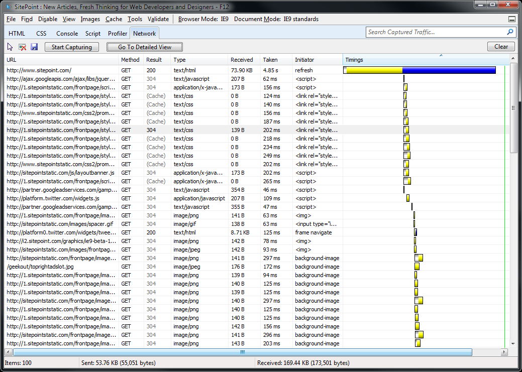
IE9’s Developer Tools have improved a little since IE8 with the addition of a new Network tab to analyze traffic and latency:
IE9 screenshot
IE9 developer tools – click for full size view
It’s a welcome addition, but it’s clunky and less usable than Firebug’s Net tab or Webkit’s Developer Tools Resources panel.
IE’s Developer Tools have always felt like a rushed component bolted onto the browser a few minutes before release. It’s useful, but the interface requires a design and usability overhaul. I’d have expected more from the company which produces Visual Studio.

Summary

It’s early days for IE9, but it’s already apparent that the browser has taken a giant step beyond its predecessors. IE8 fans will still recognize their browser and some previously disaffected users will return.
The simpler interface and amazing speed are the key improvements — I will certainly use it for fast-browsing situations, perhaps in preference to Opera or Chrome. That said, IE9 isn’t perfect; the interface requires tweaking and many HTML5 features are missing. The lack of XP support and sedate update schedule is also worrying.
The IE team have much work to do before the final release, but the IE9 beta is impressive. Microsoft is back in the browser game.
 

The Difference Between AMOLED and SLCD Screens

The Difference Between AMOLED and SLCD Screens


Remember a few months ago, when HTC decided to  stop using AMOLED screens because of shortages? And how they decided to switch to SLCD screens instead? Well, the guys over at Engadget have looked at the differences in SLCD and AMOLED screens on two HTC Desires. One Desire had an AMOLED, the other had a SLCD display. See below.


At first glance, there aren’t really any noticeable differences. But upon closer inspection, they found that the AMOLED still beats out the SLCD in terms of vibrancy and brilliance. However, the SLCD appears to have warmer tones, giving it better color definition than the AMOLED display. This is surprising, considering that AMOLED screens are almost the best money can buy, next to the Super AMOLED displays found on the Galaxy S phones. It looks like HTC made the right decision when it went with SLCD displays. Pretty damn close!
This observation begs the question: how many people will notice? Obviously, those of us in the Android community will always know, but will anyone in the consumer market really notice the difference between AMOLED and SLCD screens? Can you tell the difference? Does it bother you?
Source Engadget
The Complete Overview:

AMOLED means Active Matrix Organic light emitting diode

Active matrix (AM) OLED displays stack cathode, organic, and anode layers on top of another layer – or substrate – that contains circuitry. The pixels are defined by the deposition of the organic material in a continuous, discrete “dot” pattern. Each pixel is activated directly: A corresponding circuit delivers voltage to the cathode and anode materials, stimulating the middle organic layer. AM OLED pixels turn on and off more than three times faster than the speed of conventional motion picture film – making these displays ideal for fluid, full-motion video.
SLCD MEANS SUPER LIQUID CRYSTAL DISPLAY
SLCD is the latest generation of LCD technology ( By Joint venture between Samsung Electronics and Sony) that offers improved performance from earlier LCD panels including approximately five times better power management. SLCDs also offer an enhanced viewing experience with wider viewing angles that are enabled by Sony’s new VSPEC III™ technology.

New Apple iPod touch: An Overview

New iPod touch
The iPod touch has been the most popular iPod for Apple. In fact, it has been the most popular product for Apple, a title that was previously held by the nano. People seem to have taken very well to the touch, a device that offered them all the iOS goodness of the iPhone without the phone (and contract). It has been a huge success as a gaming platform too, selling more than the number of handheld consoles that Nintendo and Sony sell combined, with 50 percent of worldwide market share. So how can you make something so great even better?


Well, the first thing that Apple probably has in mind when making newer versions of existing products is how they can make it smaller. The older iPod touch was impossibly thin. They just couldn’t make it any thinner. But that’s what we think. To prove us wrong, Apple has done just that. Not only did they make it thinner they also added in more stuff to it, including two cameras, one of which records in HD!
The older iPod touch was 8.5mm ‘thick’, while the new one is just 7.2mm. When you look at that figure and what all Apple has added in the new touch, you realize that Apple’s engineers are a different breed of people, capable of bending the laws of physics in a way that a common man cannot even comprehend (nor can the engineers of other companies for that matter).


There are five major additions to the new touch. First is the Retina display, which debuted on the iPhone 4. It’s 960 x 640 pixels, which is four times the resolution of the older iPod touch displays and since the size has remained unchanged at 3.5-inches, it has an amazing pixel density of 326 ppi, which is the highest for any mobile device, so high that you cannot see individual pixels with the naked eye.
The second addition is the A4 chip, same as the one found on the iPhone 4. Rumored to be clocked at around 1GHz, the new chip will make the iPod touch much faster and will also significantly improve the gaming experience as now the developers can make more detailed and high quality games knowing that the processor is fast enough to handle them.
Another thing that will make gaming better is the addition of a gyroscope, which is the third important addition. The three-axis gyroscope will make motion based gaming a lot more precise, while adding new ways to control the games.
The next important feature is the addition of a front video camera. It can record videos and images in VGA resolution. With it you can make FaceTime calls with people using the new iPod touch as well the iPhone 4.


The last major addition is the camera on the back of the device. With it the new iPod touch can record videos in 720p resolution at up to 30 frames per second and also take pictures in 960 x 720 resolution. Just like on the iPhone 4 the rear camera can be used during a FaceTime call to show the person on the other side what you are looking at. You can geo-tag the images using Wi-Fi. Whether the camera on the back supports autofocus or not is not mentioned. However, my guess is, it doesn’t. But for such a thin device, it is a miracle they managed to put in a camera capable of recording HD videos.
Visually, you will notice that the back is now completely flat and not curved as on the older model. Also, the tiny spot on the top left, which was the Wi-Fi antenna, has now disappeared and one wonders where Apple could have relocated it. I guess we will have to wait for iFixit’s teardown for that. Apart from that the new touch is identical to the older model.
The battery life on the new model is rated at 40 hours for audio and 7 hours for video, which is longer by 10 for audio and 1 hour for video than the older model. This, despite the thinner size and added battery-consuming features. It’s sorcery, I tell you!
The new iPod touch will be sold in three capacities; 8GB, 32GB and 64GB models, and unlike the previous generation, this time it seems they all will get the same hardware. They will be priced at Rs. 15,400, Rs. 19,900 and Rs. 25,900 respectively.
The Good:

  • It’s impossibly thin
  • Retina display
  • A4 processor
  • 3-axis gyroscope
  • Front VGA camera for FaceTime
  • Rear camera for recording HD videos and stills
  • Improved battery life, despite all the above additions and size reduction!
  • There is still a loudspeaker somewhere in there
  • Did I mention how thin it is?

The Bad:


  • Only 256MB of RAM

  • Display does not use an IPS panel like the iPhone 4

  • 64GB is still the maximum limit

  • An FM radio would have been nice

  • No autofocus for the rear camera, and low resolution still image capture

  • New Apple iPod nano: An Overview

    iPod nano
    The iPod nano’s design has more or less been the same ever since it was launched. They may not look identical but it has always looked like a slimmed down iPod classic. This year, however, Apple gave the nano its biggest design change ever.


    Enter the touch screen. Yes, the multi-touch, capacitive touch screen has finally made its way into the cheaper iPods and the nano is the first and perhaps the only iPod to get it. Since the click wheel is gone, the nano is much smaller than before, 46 percent smaller and 42 percent lighter to be precise. All you see in the front now is the 1.54-inch display with a resolution of 240 x 240 pixels. The new nano is now closer than ever to matching the definition of its name.
    On the top of the nano you will find the sleep/wake and volume buttons, and on the bottom is the dock connector and the earphone jack. On the back is a clip, so you can attach it to your shirt or bag. Visually, the new nano looks almost exactly like the shuffle, except it has a touchscreen instead of buttons and a dock connector.


    The interface of the new nano is based on the iOS devices. You will see four icons at a time on the screen and to see more you need to swipe left. To get back you swipe right and to jump to the first screen you press and hold anywhere on the screen. You can rearrange the icons on the screen any time. Just press and hold on the icons until it jiggles and then move it to wherever you want. You can also rotate the orientation of the display by just using your two fingers on the screen and doing a twisting gesture. I wonder why one has to do this manually though; why can’t the accelerometer do it on its own?
    When you go into the music playback screen, you will see that the album art takes the entire screen in the background. On the front you will see the track info on the top, the playback buttons in the middle. To get more options such as repeat, shuffle or Genius, just swipe left on the screen to get them.
    The new iPod nano comes with a built-in FM radio (with Live Pause) and can also display photos. However, due to the smaller display size video playback is no longer an option. This is a major omission compared to the previous generation model, which cannot playback video but also record it using its built-in camera.


    Other features include shake to shuffle and a pedometer for fitness freaks as well as support for the Nike + iPod Sport Kit. The new nano will be available in six colors, plus a (PRODUCT) RED version, available exclusively through the iTunes Store. The battery life is rated at 24 hours for audio playback, which is the same as the previous generation models. The new nano will be sold in two capacities, 8GB and 16GB for Rs. 10,700 and Rs. 12,700.
    The Good:
    • Really small
    • Multi-touch display
    • Interface looks well designed
    • Built-in clip
    • Only iPod to have built-in FM radio

    The Bad:


  • The screen looks bit too small

  • No more video recording and playback

  • New Apple iPod shuffle: An Overview

    iPod shuffle
    The iPod shuffle has always been very small, but with the third generation model, Apple just broke all notions of what a small player should be with what looked like an eraser. It was the smallest music player ever, but unfortunately, this size zero came at a cost, which was the loss of buttons on the player itself. The shuffle was then dependent on its earphones to control the music for it and without them it was as good as a paper clip.


    This also meant that users could not use their own headphones with the shuffle as then they would have no way to control it. An alternative would be to buy expensive adaptors that would let you plug in your own headphones and control the player.


    Apple realized the problem with this design and so for the fourth generation model they have gone back to their older device. The new shuffle looks a lot like the second generation model, but is now smaller. It uses an anodized aluminum body and comes in five different colors. As with the previous two generations, it comes with a clip on the back, so you can wear the player without the need for any other accessories. The controls are now on the player itself, so you can use any headphones with the device. The new shuffle still retains the VoiceOver feature, which debuted with the previous generation model.


    The new shuffle has a battery life of 15 hours, which is pretty impressive for such a small player. Only a 2GB model will be sold, which will be priced at Rs. 3,200.
    The Good:
    • Brings back the familiar buttons that we all know and love
    • Really, really small
    • A really really good sound quality
    The Bad:


  • No display, but that’s okay :)

  • Tuesday, September 14, 2010

    FarmVille vs. Real Farms

    FarmVille vs. Real Farms

    With all those millions of Facebook and iPhone users tending to virtual crops and sharing them with friends, have you ever wondered how their toils stack up against actual real-life farmers?
    How does our output of digital (and decidedly less tasty) tomatoes compare with our worldwide production of real tomatoes? And perhaps most importantly, who are these casual croppers, and are they anything like their plow-toting counterparts?
    We broke it down by the numbers and put some of these FarmVille trends in perspective for you.
    Go on. Harvest (Harvest) it.
    FarmVille Infographic
    What do you think? Does FarmVille ignite our romance with all things pastoral? Are digital crops poised to overtake real ones in terms of GDP? What does all this mean for the fate of humanity?
     

    Google Hints at New Directions for Android Tablets

    Google Hints at New Directions for Android Tablets


    Froyo might be the last word for Android smartphones, but Google denies it’s meant as a tablet OS, adding fuel to rumors that we’ll be seeing Honeycomb or Gingerbread-enabled tablets competing against the iPad sometime soon.
    At least one Google (Google) executive has been saying publicly that the company doesn’t see the most recent iteration of the Android (Android) operating system or the Android Market (Android Market) as entirely appropriate for tablets, suggesting that tablet-specific OSes might be forking from the Android family in the near future.
    Hugo Barra is Google’s director of products for mobile. In recent comments to TechRadar, he said that while the company has seen Android 2.2 (which, like the rest of Android’s distributions, is open-sourced and free for anyone to download) running on tablets, that isn’t one of the OS’s intended purposes.
    “Froyo is not optimised for use on tablets,” said Barra. “The way Android Market works is not going to be available on devices that don’t allow applications to run correctly. Which devices do and which don’t will be unit-specific… If you want Android Market on that platform [a tablet running Froyo], the apps just wouldn’t run, it is just not designed for that form factor.”
    He continued to say that Google is working on a different UX for a tablet-friendly Android Market. We would infer that, unlike the less-than experience of the first Android devices via-a-vis the iPhone, many of the first Android tablets could be more competitive with the currently market-leading iPad, thanks in large part to an operating system that’s optimized for the full breadth of tablet hardware functionality.
    So, what could these mysterious operating systems be, and how soon could we see them? Will they be available on the already-released Dell StreakSamsung Tab (which ships with Android 2.2)? (which ships with Android 1.6) and While most of what we “know” about Android-for-tablets operating systems is shrouded in rumor, we are fairly certain that the fork will begin with Gingerbread, a.k.a. Android 3.0, which may be released as soon as this fall. And Honeycomb is thought to be the next iteration of the same fork.
    We can also safely speculate these OSes won’t run on any but the highest-powered mobile devices, such as the Google/Verizon tablet that we expect to see around the holiday season.


    35 Entertaining 404 Error Pages!!!

    35 Entertaining 404 Error Pages!!!!


    “404 Not Found.” These three little words can make any Internet explorer an unhappy camper. After all, who hopes to click on a broken link or stumble upon a moved or deleted page while cruising around the web?
    Luckily, some web designers have chosen to end the misery of encountering a 404 error page. Instead of letting their site readers bump heads with a nasty dead-end error message, they’ve managed to squeeze a little entertainment out of it.
    Below you’ll find some of the most entertaining 404 error pages on the web. We’ve listed them alphabetically to avoid playing favorites, but they’re all worth a look. Share your favorite 404 error page designs in the comments below!
     

    501st Legion is a Star Wars costume organization. It only makes sense that its 404 page would play on Obiwan’s famous jedi mind trick with a “weak-minded” stormtrooper.
     

    Yes, Houston, a 404 is definitely a problem.
     

    A nice ol’ chap comes to your assistance on ApartmentHomeLiving.com if you run across a 404 error page. Click the lovely lady peering from behind the frame for proper navigation suggestions.
     

    “Uh-Oh! SpaghettiOs!” You know you’re a part of pop culture if your jingle makes it into a 404 error page. The popular SpaghettiOs marketing jingle is here to stay.
     

    Head over to Blippy’s 404 page for an adventure. Keep clicking on the boy dressed in a unicorn outfit to discover a triple rainbow! Who knew a 404 page could be so fun?
     

    In an ode to early horror films, Factor D features an appropriately horrific 404 error accompanied by a beautiful, yet terrified scream queen.
     

    Many 404 error pages apologize for the error. Not this one. It’s obviously your fault.
     

    This 404 error page is a beautiful depiction of “Track 404,” a fictitious NYC subway line. Check it out to experience the full animation.
     

    “You can click anywhere else, but you can’t click here.” Love it.
     

    Bottom line: You can’t go wrong with cute kittens.
     

    Most of us would like to run into a 404 error page just as much as we’d like to run into the Grim Reaper.
     

    When you’re facing “sharks with laser beams attached to their frickin’ heads,” what do you expect? Definitely a 404 error.
     

    Well, that can’t be good.
     

    Picking a 404 error page design that is consistent with your name is an appropriate move. CSSscoop chose a melting ice cream cone, with a scoop of ice cream, of course.
     

    Sarcasm in dire situations is always appreciated, right?
     

    Try not to make any missteps on GOG, or you’ll end up lost in the cosmos.
     

    Insulting your readers doesn’t usually help, but this 404 made me chuckle.
     

    Hoppermagic chose to stick to its brand imagery when creating its 404 page.
     

    There’s just something about a really frustrated baby that catches your attention. And if you’ve made it to this 404 page, you probably feel his pain.
     

    If you can’t think of something clever to say on your 404 page, just write exactly what your users are thinking.
     

    Jackfig added a creative touch to its 404 error page, with an inspirational haiku.
     

    Jolie Poupée, creator of eco-friendly children’s clothes, serves up an audience-appropriate 404 on its site.
     

    This 404 error page is reminiscent of the kitschy tourist shirts that your lousy friends and relatives buy you when they visit amazing places.
     
    24. Merge

    Prithee, go medieval on your site’s visitors if need be.
     

    Imagery always makes a 404 more entertaining.
     

    Some 404 error pages do a wonderful job of explaining to users exactly what caused the 404 error. OrangeCoat provides a fun decision tree for lost web surfers that is sure to help them along their merry ways.
     
    27. Oroza

    Have fun with colors, shapes and exclamations.
     

    Sick Designer captures the depression that a 404 can cause on its error page.
     

    How fitting that a student-centric site would feature an addition problem on its 404 page.
     

    This page just pops. We like it.
     

    For true entertainment value, why not just tell a story? The North Face does just that by creating a tale about link-eating mountain goats.
     

    You might have been pwned, burned, punk’d or rickrolled recently, but have you been 404′d? Click here to join the party.
     

    Excitement! Adventure! Ahhhhh, where I am?!
     

    Our sentiments exactly.
     

    If, after searching for hours, you still can’t find the page you were seeking, Chuck Norris probably has it.